A Short Introduction to Typography for the Web
Video Introduction
Content Introduction
Objectives
- list common typography terms
- compare some print and web design typography terms
- experiment with a simplified interactive web design tool
- create a unique design
Why Learn Typography?
Understanding typography is essential for designers. Typography often forms the basis for detailed communication, and is very important for web and app design.
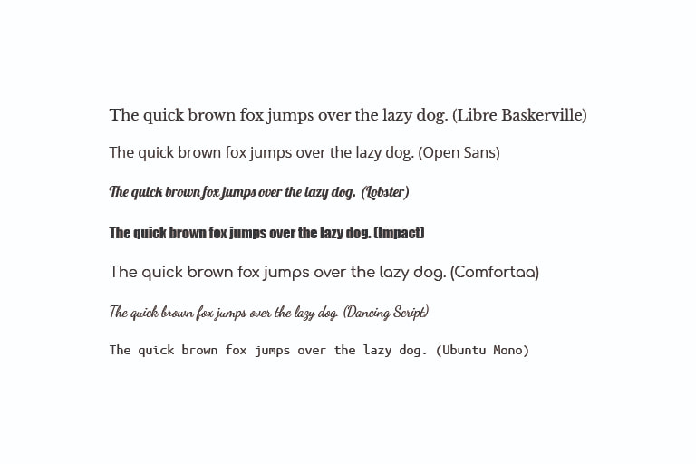
Types of Fonts
Serif
A serif typeface is a typeface with decorative strokes that finishes off the end of a letter's stem (sometimes also called the “feet” of the letters).
Sans Serif
A serif typeface is a typeface that does not contain decorative strokes that finish off the end of a letter's stem. The term 'sans' means without.
Display
A display typeface is a typeface that is intended for use in large sizes. Display typefaces often have more eccentric and variable designs than typefaces generally used for body text.
Handwriting
A script typeface is a typeface based upon the varied and often fluid stroke created by handwriting. They are generally used for display or trade printing, rather than for extended body text in the Latin alphabet.
Monospace
A monospaced typeface is a typeface whose letters and characters each occupy the same amount of horizontal space. Monospace typefaces are sometimes referred to as fixed-pitch, fixed-width, or non-proportional.
CSS Declaration
/* can list multiple fonts */
/* browsers select the first font in the list that is installed */
font-family: 'Franklin Gothic Medium', 'Arial Narrow', Arial, sans-serif;
Code Example 1: font-family
/* try changing the font-family */
/* common pre-installed browser fonts inclue: */
/* Arial, Verdana, Tahoma, Georgia, Garamond, Courier, cursive, fantasy */
font-family: , sans-serif;
The Quick brown fox jumped over the lazy dog.
Font Sizes
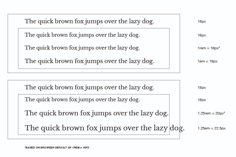
Units
- pt: traditional unit for print, one inch is 72 points
- px: traditional unit for web design, may create accessibility issues with type
- rem: relative measurement based on the root HTML element
- em: relative measurement multiplier of the current font size
Rems, Ems, and Px
Using rems and ems for font size on the web allows for the user to easily scale the text as they wish. Pixels are static units and do not allow for the same level of flexibility.
Rems
Rems is the root font size of the root HTML element for a webpage. This value is defaulted to 16px but can be set by the user.
Ems
Ems is a multiplier of the current font size. If the container font-size is 16px and we set the size inside to be 2em this results in 32px;
CSS Declaration
/* these values declarations are all valid  */
/* may result is different sized text */
font-size: 16px;
font-size: 1rem;
font-size: 1em;
Code Example 2 font-size
/* try changing the font-size */
/* 12px, 12pt, 12rem, 12mm */
font-size: ;
The Quick brown fox jumped over the lazy dog.
Line Height
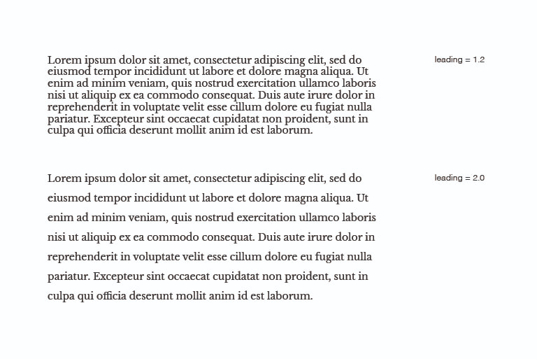
Line Height
Line height is the vertical distance between lines of text. On the web, it is an equal amount of space above and below text on a line.
Leading
Leading is the desktop publishing or print term. However, leading is the amount of space below a line of text.
CSS Declaration
/* CSS uses line-height */
/* can be set with units (px, rem, em) */
/* it is common to use the unitless number as a multiplier */
line-height: 1.1;
Code Example 3 line-height
/* try changing the line-height */
/* 1.25, 2rem, 3mm, 400% */
line-height: ;
The Quick brown fox jumped over the lazy dog.
Tracking and Kerning
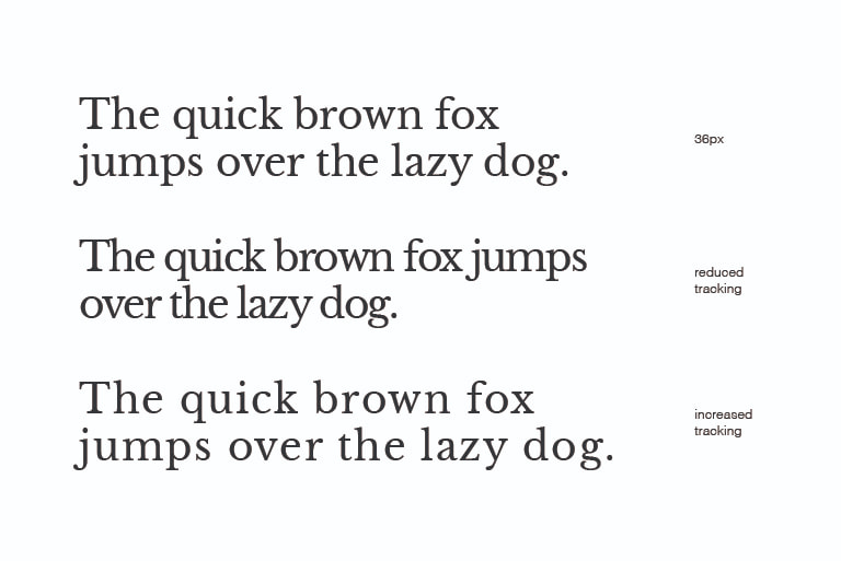
Tracking
Tracking is the horizontal space between all letters. The term tracking is commonly used in desktop publishing (print) design, the CSS equivalent is known as letter-spacing.
Kerning
Kerning refers to the space between any two letters. It is common in logo design to adjust the kerning of a wordmark for aesthetic appearance.
CSS Declaration
/* tracking is set with the CSS letter-spacing property */
/* can move the letters closer together, or further apart */
letter-spacing: .2rem;
letter-spacing: -1px;
Code Example 4 letter-spacing
/* try changing the letter-spacing */
/* .2rem, -5px, -1ch */
letter-spacing: ;
The Quick brown fox jumped over the lazy dog.
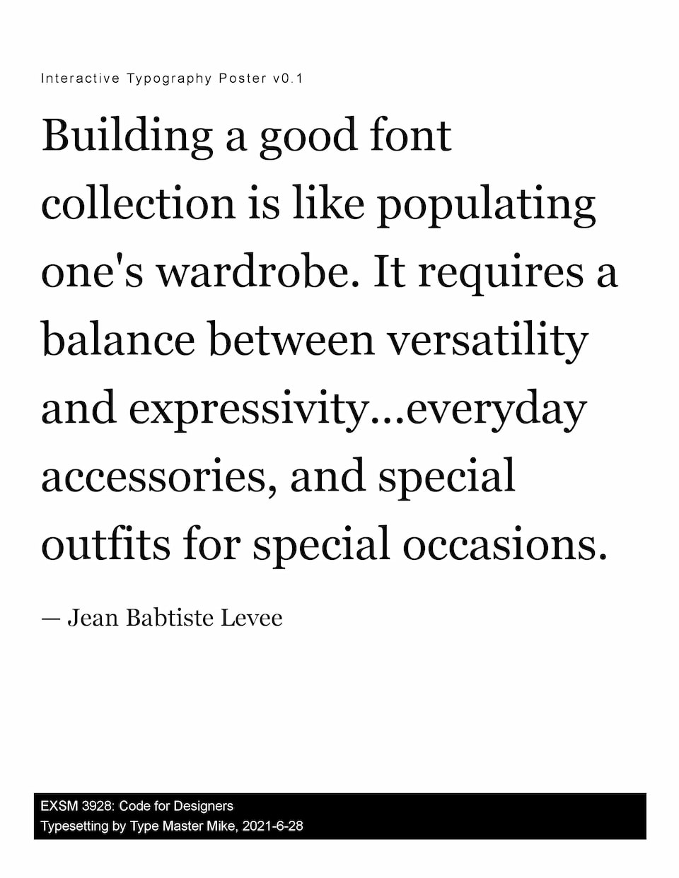
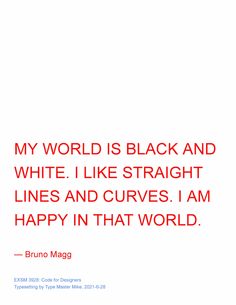
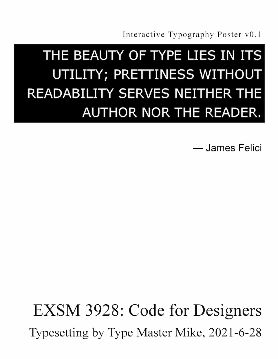
Example Typography Posters
Use the Interactive Poster Tool
In the next section, you will have access to an interactive typography tool. You can use this tool to experiment with the topics learned here.
Common professional design tools like Adobe XD, Figma, Sketch (and more) also share this functionality.
This interactive poster tool has been simplified to help learn these topics in an accessible and intuitive manner.
Use the controls to make adjustments to font family, font size, tracking, line height, text color, background color, text transformations, and alignment.
You can save your design to PDF at any time by using ctrl + p or cmd + p to print, then select save to pdf.
Click Here to Build a Typographic PosterAdditional Resources
- The designer's guide to web typography. (2021, June 16). Elementor.
https://elementor.com/blog/guide-to-web-typography/ - Typography for developers. (2019, September 10). CSS-Tricks.
https://css-tricks.com/typography-for-developers/